Verizon Wireless
Objective
Help Verizon create an effortless and easy to understand experience for customer’s shopping devices and service plans.
My Role
Led design efforts for improving the experience of browsing products and services on Verizon’s web experience, overseeing a pod of 5 designers
Ideate features to test and rapidly iterate vision boards and wireframes
Built prototypes for user research sessions
Established design system components and documentation
THE PROBLEM
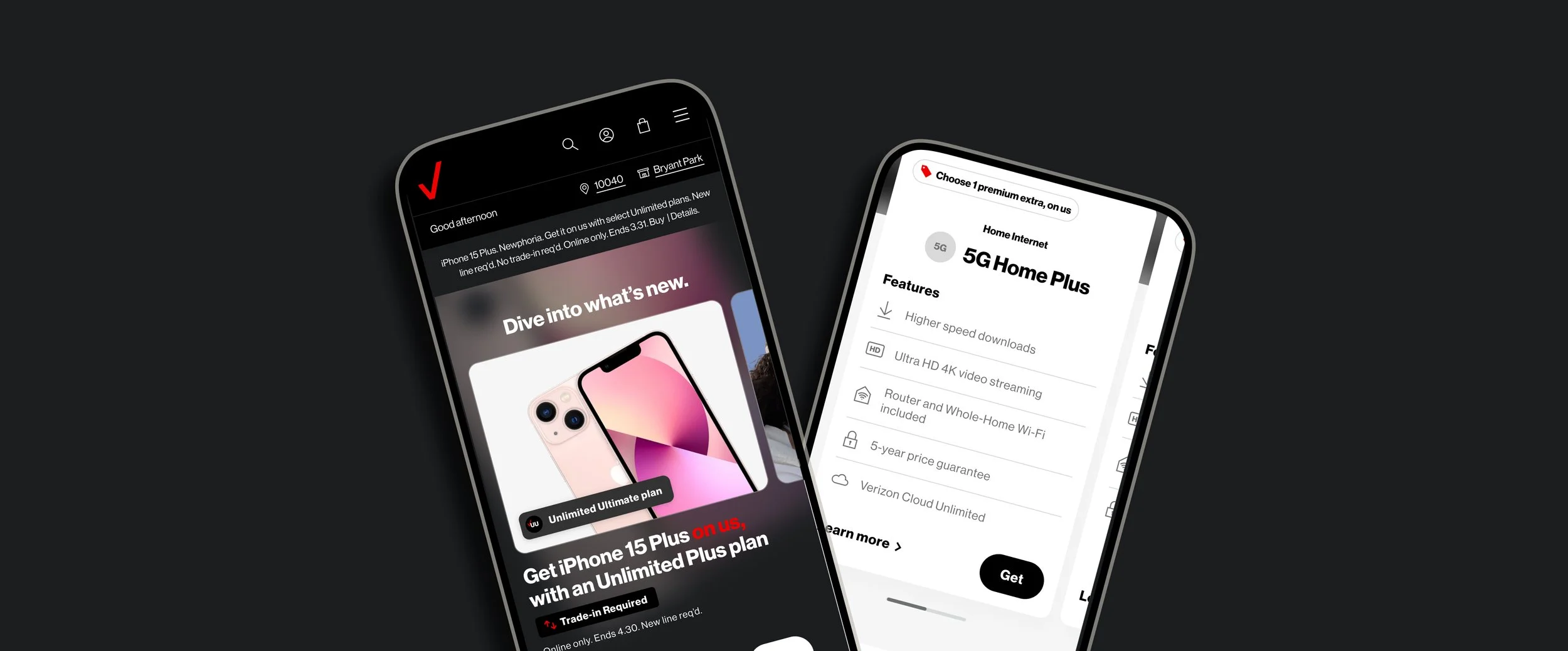
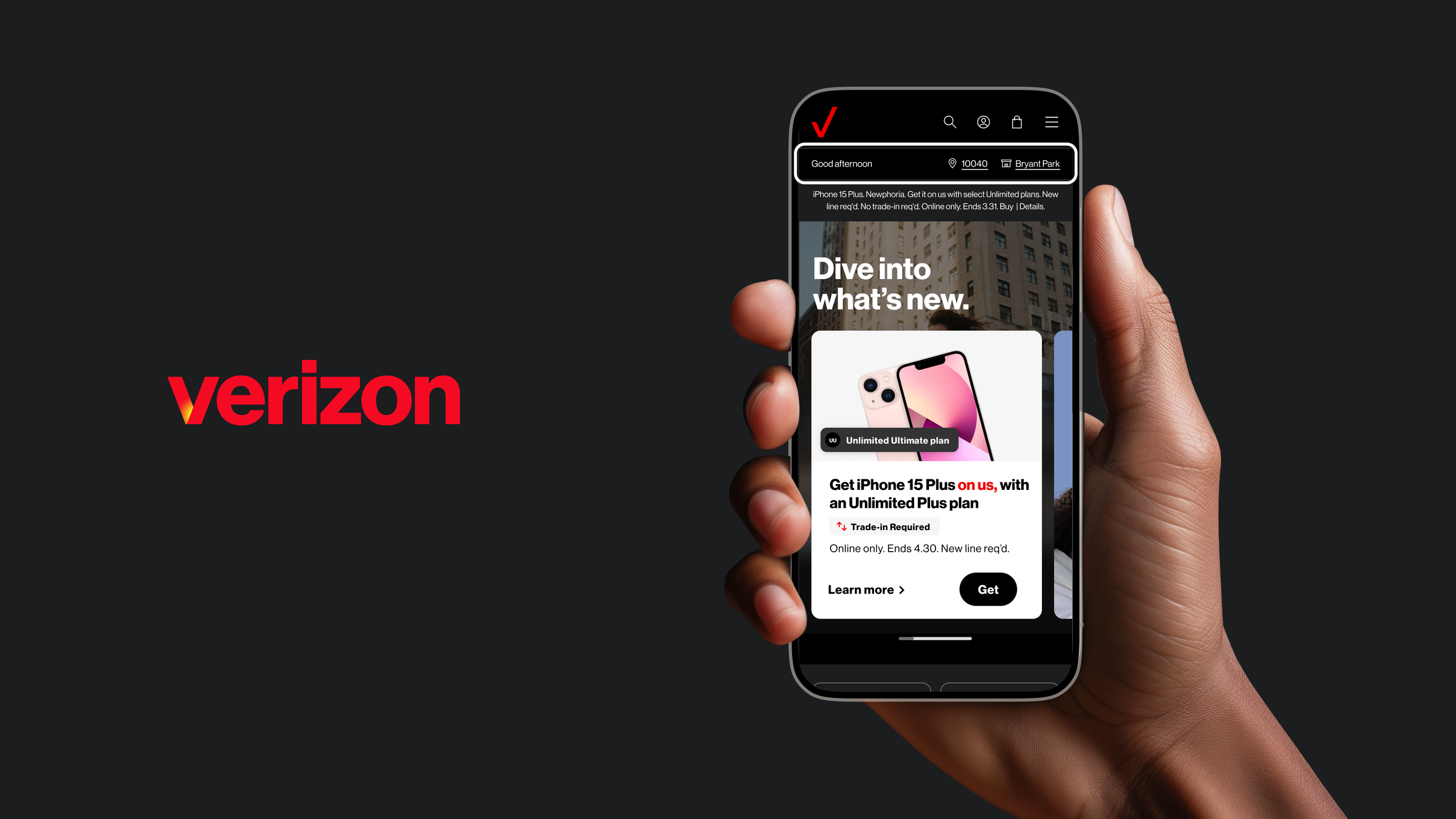
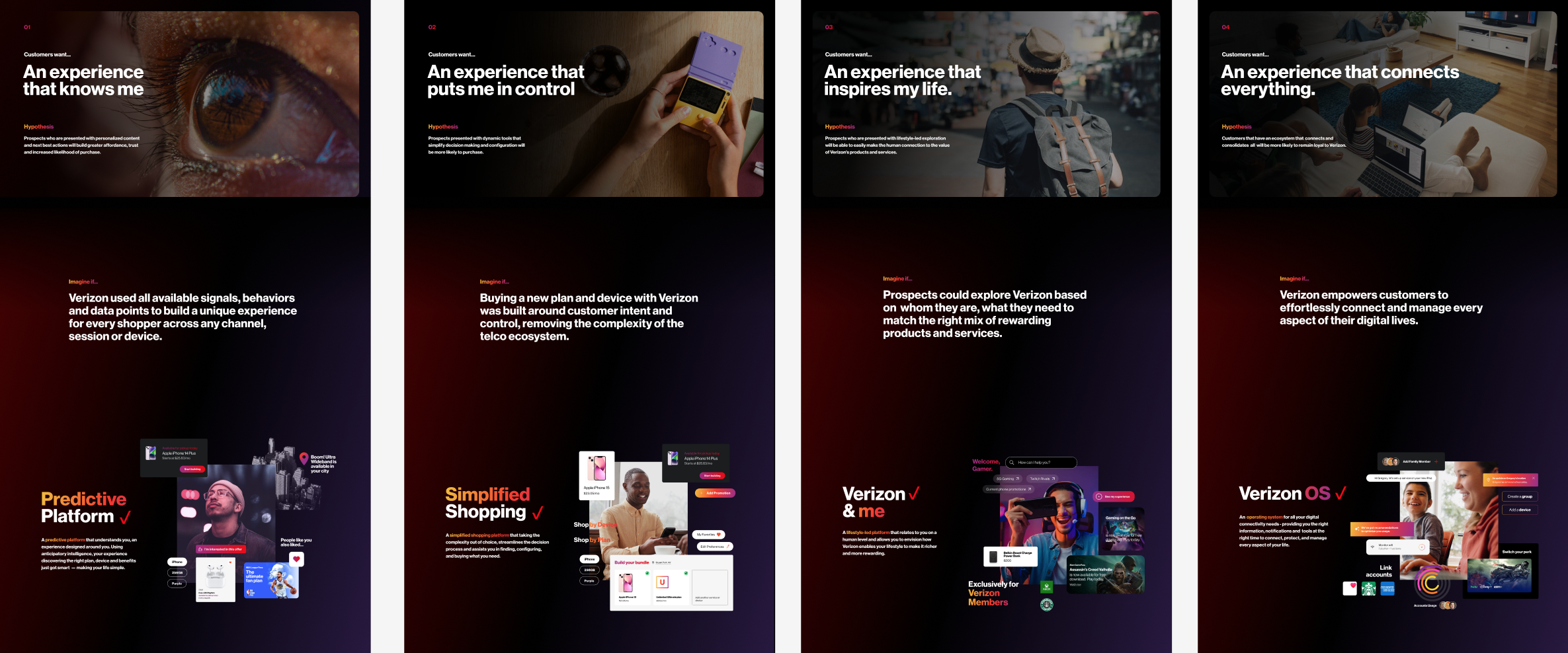
Cognitive overload on the landing page
The landing page experience suffered from high cognitive load, especially for first-time prospects. Competing messages, dense content, and unclear hierarchy made it hard for users to quickly orient themselves, compare options, and move forward with confidence. Reducing friction required clearer prioritization, contextual guidance, and a more focused decision path.
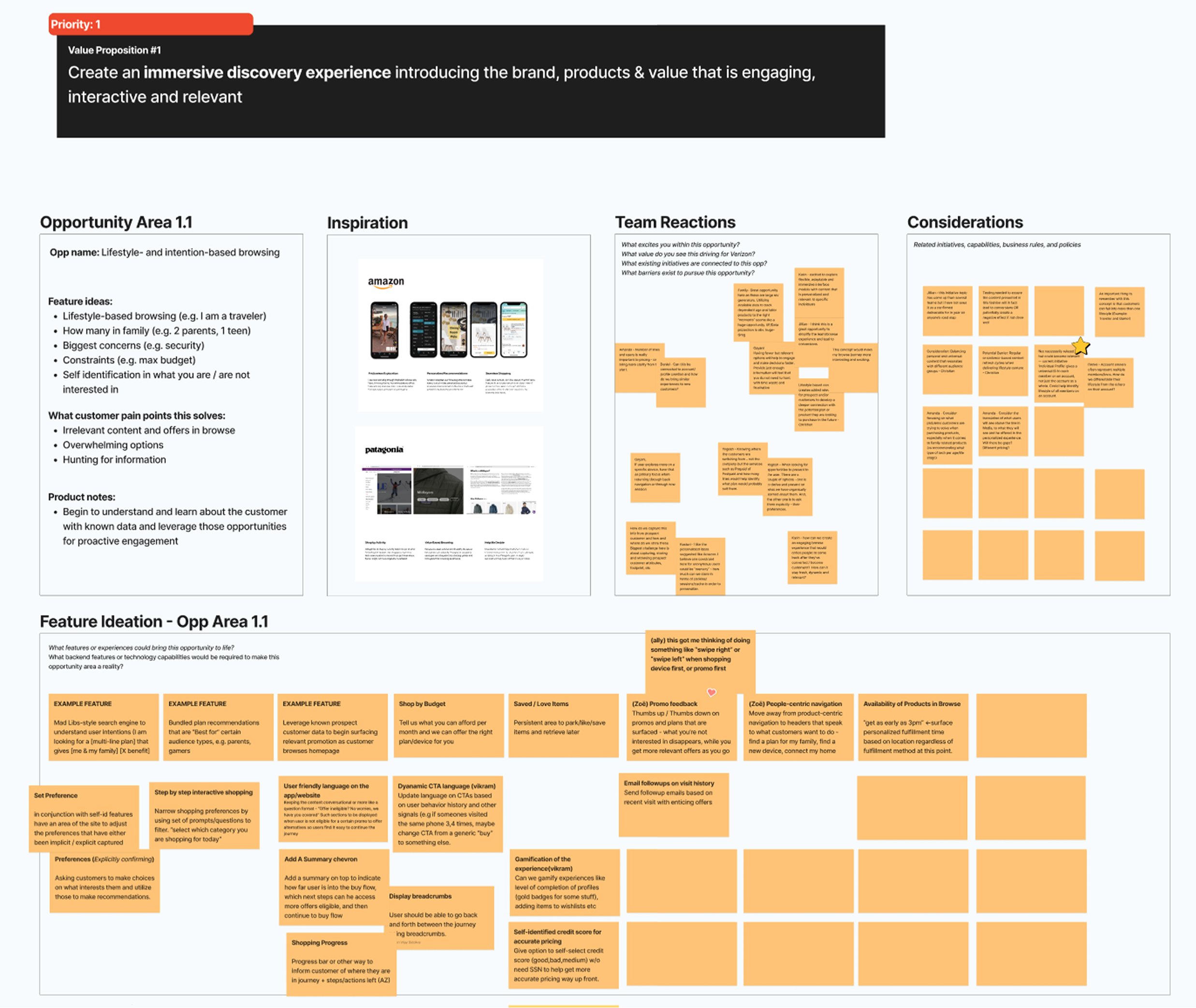
Through user research, collaborative Figjam sessions, and user journey maps, 4 key themes emerged
PROCESS
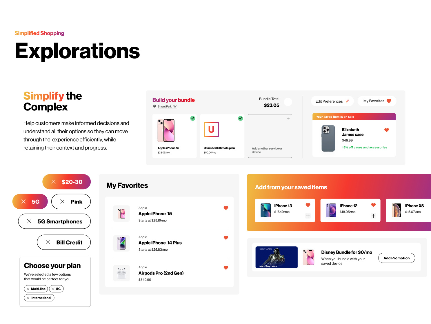
From vignettes to wireframes to high fidelity design
I created moodboard-like vignettes based on the themes identified to represent potential features and visual direction. These vignettes were a springboard into rapidly ideating features to be tested.
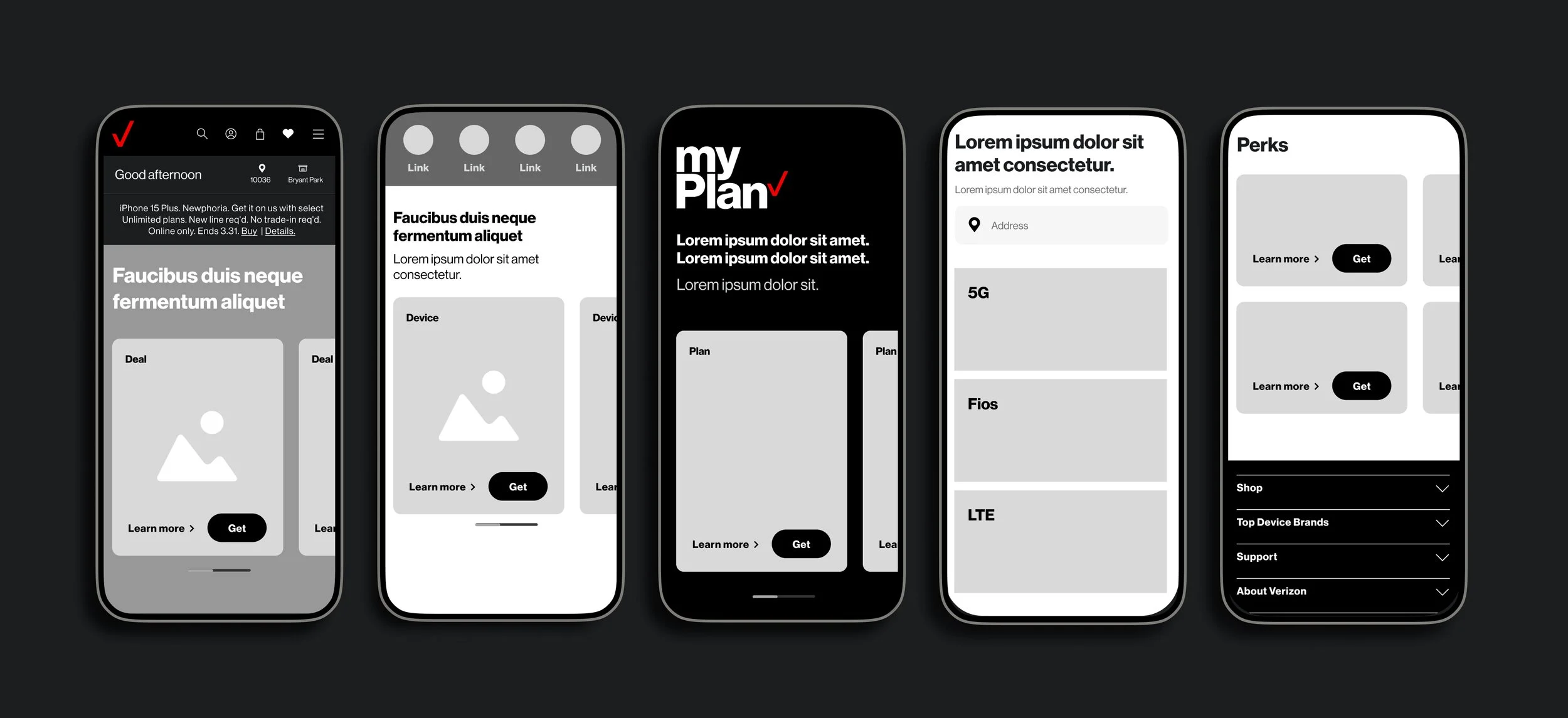
Key design decisions from wireframe to prototype
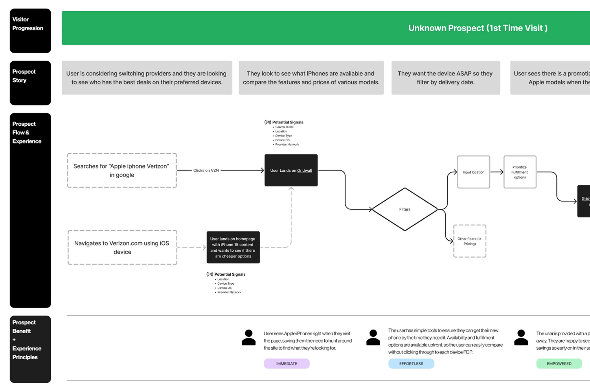
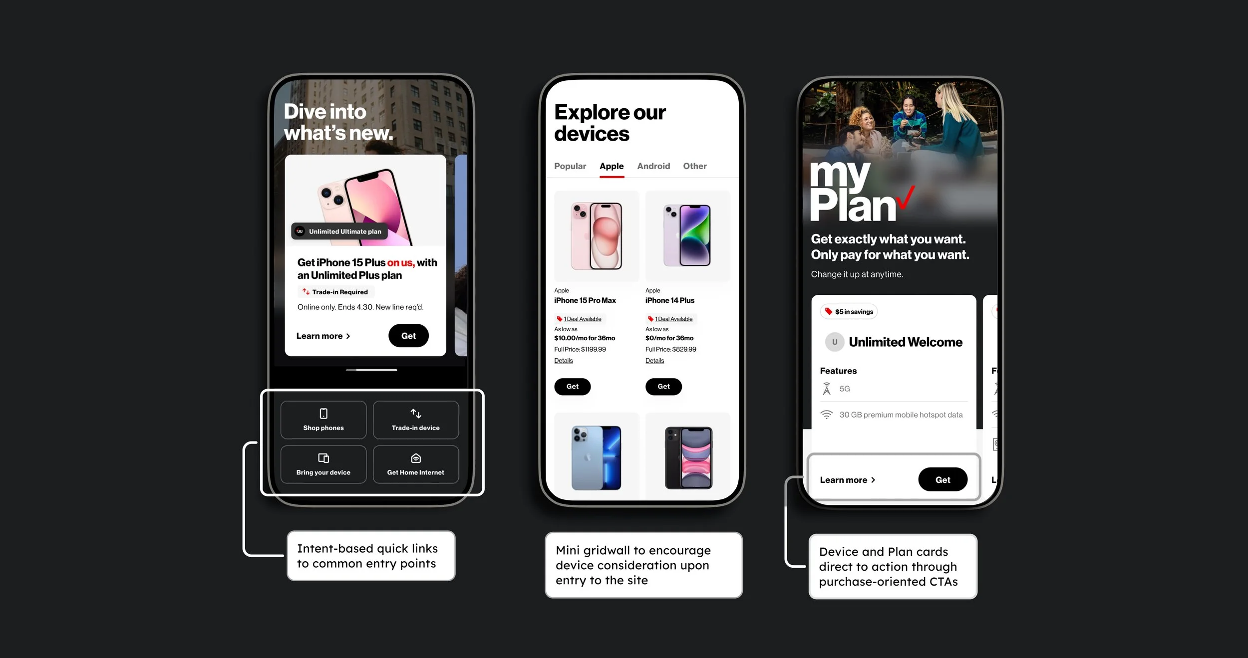
Surface intent-driven entry points early
Users arrive with different goals, whether it’s shopping for a phone, trading in a device, or exploring plans. We prioritized clear, intent-based access points to help users quickly self-select the path that matches their needs.
Encourage consideration without blocking momentum
Rather than forcing users into deep research flows, we enabled lightweight comparison and discovery directly within the browse experience.
Make next steps obvious and actionable
Once users gain confidence, the interface guides them naturally toward purchase-ready actions without abrupt context switches.
REFLECTION
Navigating rapid deadlines and overcoming challenges
This project pushed me to navigate multiple constraints, moving at an extremely rapid and iterative pace while adhering to a complex enterprise design system and brand guidelines. The goal was to push the visual direction while still maintaining the same brand essence Verizon was built on. This required me to rethink design patterns, add new components to our own internal version of their design system, and ensure consistency was achieved across other pods working on different goals.
I learned to leverage all Figma’s tools to accelerate the design process for the entire team, collaborating with the client in Figjam and pushing ideation through brainstorming sessions. It was a great opportunity to focus on theme-based goals that would really push the experience beyond MVP. The experience as a whole changed how I approached collaboration and design consistency.